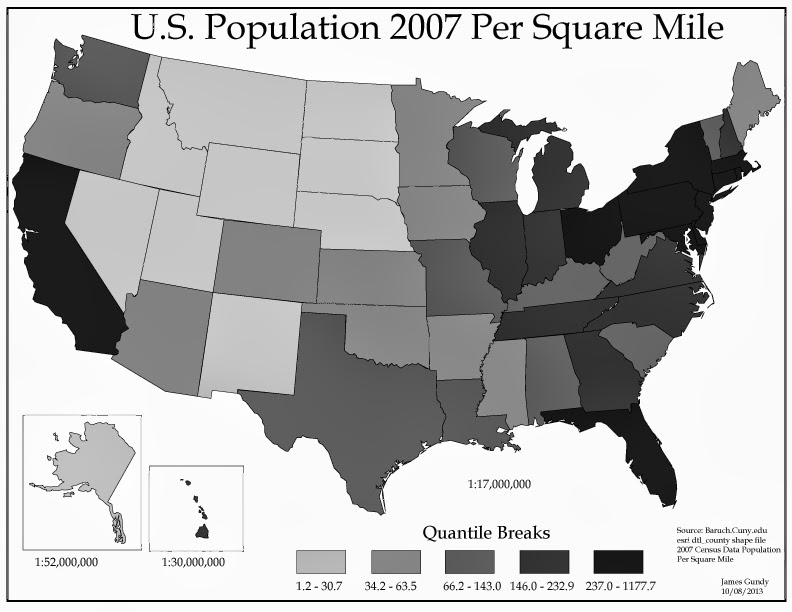
Interesting to see how the data changes when using different data classification. Natural breaks is a more accurate measure in this case. The even distribution of quantile makes the map seem more diverse if only because of the number of data sets per classification.

No comments:
Post a Comment