
Tuesday, December 3, 2013
Thursday, November 21, 2013
Super Typhoon

http://www.businessinsider.com/map-of-super-typhoon-haiyan-path-2013-11
Bivariate Map
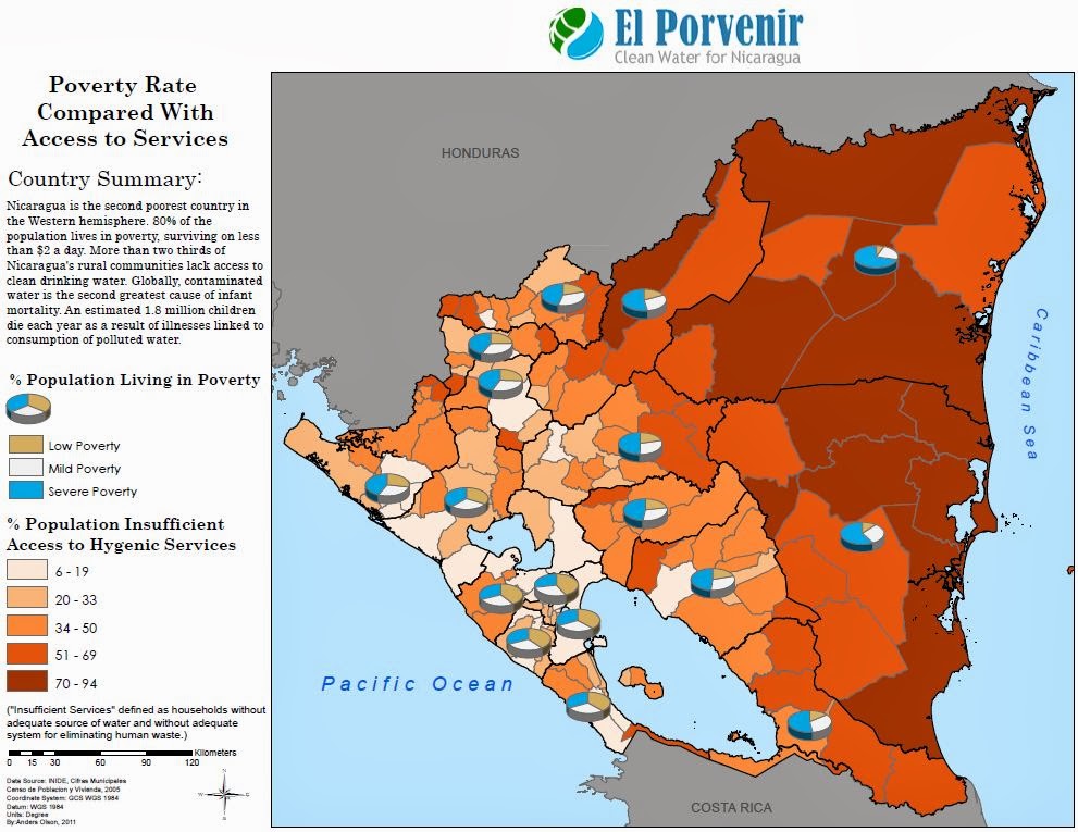
http://andersolson.files.wordpress.com/2012/09/multivariatemap1.jpg
Tuesday, November 19, 2013

Tuesday, November 12, 2013
Wednesday, November 6, 2013
Final Project
For my final project I am looking to map all major terrorist attacks by Al Qa'ida from 1992 - 2011. The interest in the topic stems from my goal to work in the intelligence community utilizing GIS and Remote Sensing and a good place to start seemed to be practicing data synthesis with map making.
The map is mainly to be a general informative map and as such it does not have a particular audience but if one does have to be specified it would be for those who work in the intelligence community as visualization to the data to help spot trends or a lack thereof.
I envision the map to be a graduated symbol map but that may change.
The scope of the map is on a global scale.
The Source will be the global terrorism database provided by the University of Maryland.
http://www.start.umd.edu/gtd
The base map will likely be exported from Arc Map but I may use an already existing illustrator base map if I can find one.
The production will begin with collecting and filtering the data. All subsequent steps will be related to applying the data to the base map
The biggest challenge will likely be defining what constitutes a major terrorist event with deciding how exactly I want to map the phenomena a close second.

This is an example of a map that displays the same theme that I want to map although I feel like it is not well done.
Monday, November 4, 2013
Dot Density

http://personalpages.manchester.ac.uk/staff/m.dodge/cybergeography/atlas/wireless.html
Isoline Map

http://earthquake.usgs.gov/research/structure/crust/
Tuesday, October 29, 2013
Lab #8

Tuesday, October 22, 2013

Lab #6

Monday, October 14, 2013
Blog #5

http://www.esri.com/news/arcuser/1012/modeling-contamination-using-empirical-bayesian-kriging.html
Wednesday, October 9, 2013
Blog #4

http://www.pophealth.wisc.edu/research-news/2013-03-12-0
Tuesday, October 8, 2013
GGS 310 Lab #5

Tuesday, October 1, 2013

Tuesday, September 24, 2013
Saturday, September 21, 2013
GGS 310 Blog #3

I selected this map because I found it really cool. The way the author used typography to create a world map is something I haven't seen before.
http://vladstudio.deviantart.com/art/Typographic-World-Map-Night-197837014
Tuesday, September 17, 2013

Tuesday, September 10, 2013
Blog #2

http://phys.org/news/2013-04-root-limits-social-mobilization.html

Thursday, August 29, 2013
GGS 310 first post

Link to original - http://static3.businessinsider.com/image/5149fd50ecad04f55f000018-900-574/ncaa-fandom-map-south-region.jpg
Subscribe to:
Comments (Atom)